Touchscreens are simple, flexible, and seem ill-suited to controlling 4,000lb machines.
But the auto industry fawns after them: every manufacturer seems to want in, at every price point. They replace knobs & dials with colossal touchscreens and bedeck every remaining surface in plastic capacitive buttons.


I never felt qualified to comment. Maybe I was missing something. Touchscreens seemed dangerous, but crash deaths are down by over 40% since 1975 (although they have increased since 2010). Reddit discusses this multiple times a week without ever reaching consensus. Plus, people still buy these buttonless cars. Perhaps I was a luddite; other people could buy their touchscreens and I would stick to my Mazdas, with their rotary knobs.
And then Mazda unveiled their new touchscreen-forward 2026 CX-5.
So I looked into it, and I’m convinced: even though touchscreens are better in some ways, car manufacturers flock to them because touchscreens are cheap to assemble & install. There are many reasons to use touchscreens, but they are all dwarfed by a culture of cost-cutting. Car touchscreens are cheap, not good.
There are many good reasons to replace car buttons with touchscreens. It would be disingenuous to argue otherwise. You can sum this up in one image:
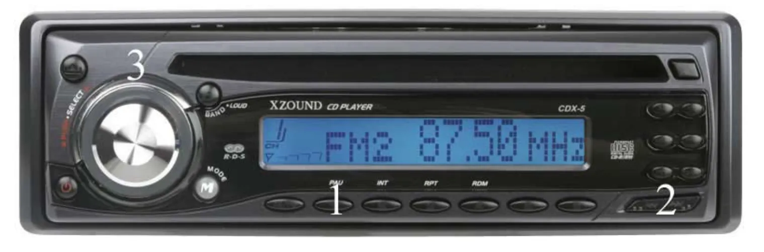
Find the pause button
Even to the most stalwart button enthusiast (👋), it should be unsurprising that touchscreens outperformed this stereo in a 2008 paper:
- Touchscreens were safer in some ways, although less safe in others. Participants made significantly fewer driving errors while using touchscreens and took significantly less time to accomplish tasks, although they had insignificantly more long glances and fewer interactions done with no glances at all (see Appendix: are touchscreens unsafe? for further analysis).
- Touchscreens were simpler. The stereo in this study “was criticized for its small buttons and poor layout,” whereas the touchscreen’s flexibility allowed the authors to offer a “rather simple interface.”
- Touchscreens are popular and cool. While gesture controls were clearly the focus of this paper, those were polarizing. Touchscreens, however, were reliably accepted and enjoyed, and the stereo’s buttons were reliably unpopular. Similar studies like Large et al 2019 also find touchscreens more “pleasurable” and “exciting” to use than alternatives.
Perhaps this is an unfair comparison. After all, that is a particularly awful stereo (button 1 is pause, by the way). But, as both The Turn Signal and a friend of mine in the auto industry put it: cars today are complicated, and adding a button for every feature would be difficult. Touchscreens can dynamically adapt, buttons cannot. This is inherent to touchscreens and it proves that touchscreens must be better for at least some UX.
This study illustrates just how much worse buttons can be. The touchscreen, in contrast, looked like this:
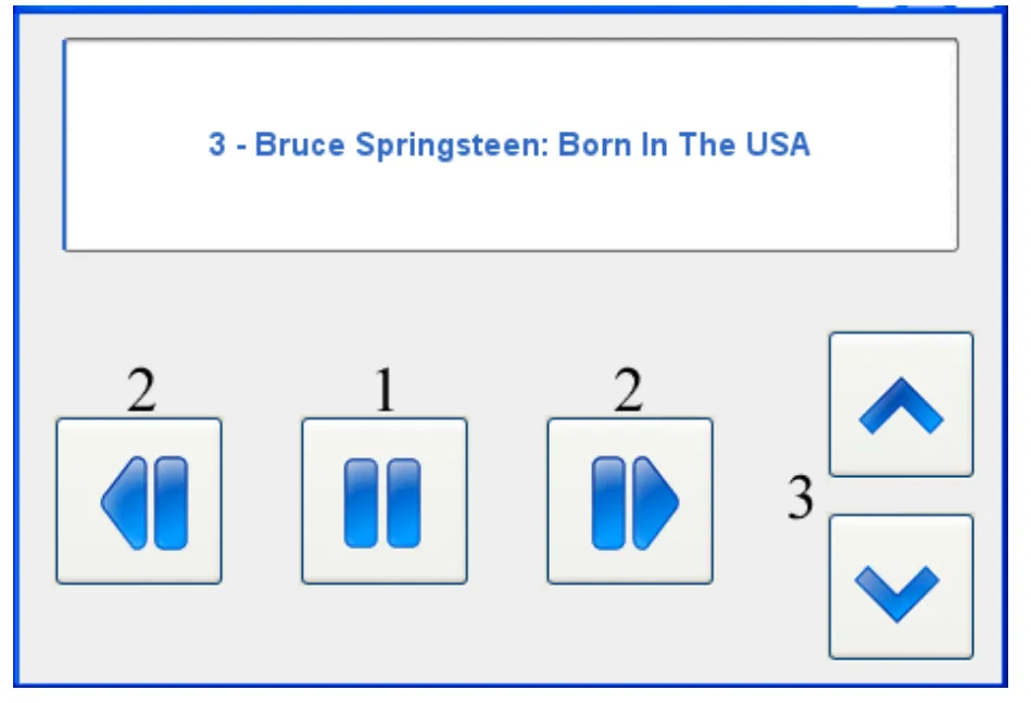
Find the pause button
Touchscreens can be better, but I don’t think that’s the primary reason car companies are choosing touchscreens. I think touchscreens are taking over the auto industry because they are cheaper than buttons.
This isn’t a new idea. As a 2023 article from Hagerty puts it (emphasis added):
I spoke with leading experts in the field, from user-experience (UX) designers to manufacturer reps and analysts. Almost all of them singled out one factor in touchscreen proliferation: cost.
But in my experience, the cost argument gets lost amongst other justifications, and it’s easy to forget its importance. So let’s examine the claim a bit.
Sandy Munro, an automotive engineer who deconstructs & audits cars (and detests buttons), estimates that the “redundancy” in some buttons in the 2022 Chevy Bolt EV costs $15 per car. Even the Hyundai Ioniq’s A/C controls, which are mostly capacitive, may cost around $50-60 per car. A Road & Track article estimates that button removal altogether saves “maybe $100 per car.” When carmakers might only make ~$6,000 profit per car, that’s a lot of money.
In contrast, touchscreens are, quite literally, free. All US cars have screens, since rear-view cameras have been mandatory here since 2018, and most of those will be touchscreens, since that’s how CarPlay and Android are typically controlled (and 98% of new US cars have CarPlay). Using that touchscreen to control your A/C costs nothing. CapitalOne AutoNavigator and that Road & Track article raise the same argument. Plus, touchscreens make it easy to sell subscriptions to features — or even remove existing ones—without any manufacturing changes. They can generate revenue.
If you’re not quite convinced, here’s the CEO of Ferrari on this exact point:
[…] Touch is something that is made by — to say, for — the supplier advantage. Making a touch button is cheaper than making — 50% cheaper[—]because if you have to make all these nice, beautiful, crafted buttons, you [need tooling].
In short, touchscreens yield part reduction, which automakers will do anything for.
Tesla is “very good” at reducing part count to reduce costs. Ford made the news for removing “about 2,400 parts” from their 2024 F-150, and their new EV platform reduces part count “by 20%”; this still may not be competitive with Chinese manufacturers. GM reduced part count on the Cadillac Lyriq by 24% in 2025. Toyota’s Area 35 program aims to reduce part counts and floor space usage by 35%.
There are many reasons to cut parts: it lowers weight, improves EV battery life, streamlines aesthetics, shortens production time, and decreases logistical risk. But it also reduces cost.
Sandy Munro on the cost of each additional part on the line:
At Ford, if we could get rid of — in the olden days — if we could get rid of a part number, we were looking at $75,000 just to have that part number there.
Touchscreens let manufacturers cut costs in the name of modernity. I’m sure automakers add touchscreens because they’re cool and because users like the simplicity. But I also suspect every internal meeting ends with, “and it’s cheaper!” I expect they’d do things differently if touchscreens were more expensive.
Touchscreens reduce parts. Each part costs money. Elon Musk:
The best part is no part. The best process is no process. It weighs nothing, costs nothing, can’t go wrong.
Consider capactive buttons. You know, the unpleasant buttons on your microwave, or alongside the shifter on your $100,000 2019 Porsche Cayenne:
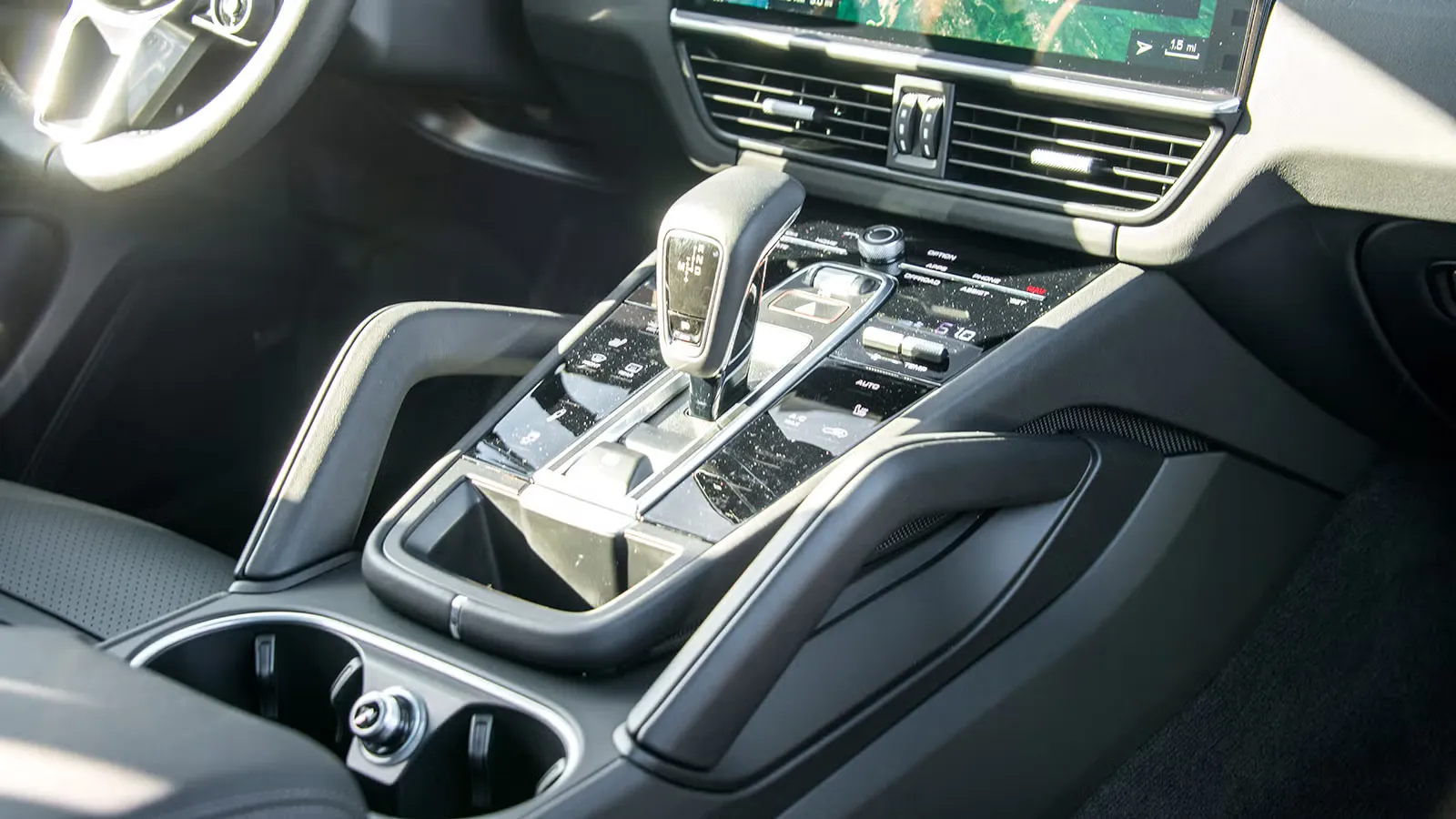
Just like my microwave! (via Autoweek)
These are a great proxy for touchscreens: they are just as impossible to find and use blindly. In fact, they’re kinda worse — they can’t dynamically adapt like a touchscreen can.
But automakers still flock to them because they use fewer parts. Capacitive buttons can be made with basically any microcontroller (that your car already has) and a wire. Real buttons require… a button. And all of the bin space, trained assemblers, and testing that requires.
All of that costs money.
Cost is the first reason Franz von Holzhausen, Senior Design Executive at Tesla, gives for swapping some physical buttons for capacitive ones:
Yeah, capacitive’s a lot less parts — cheaper, smaller, we have less gaps to deal with.
Harder to find, unsatisfying to use, cheaper to make. I lean hard into von Holzhausen’s first point. When cars switch to capacitive buttons, I think one thing: cost.
Let’s follow the evolution of touchscreens & capacitive buttons in the VW Golf. Their infotainment console had plenty of physical buttons in 2016 and 2017, surrounding a 6.5" touchscreen:
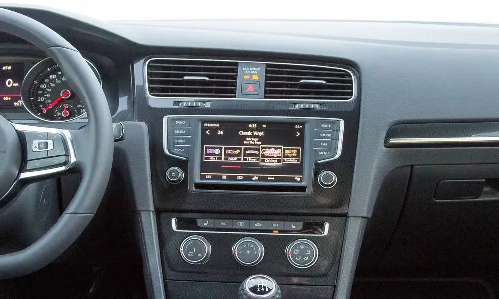
2017: physical buttons (via Autoweek)
Then in 2018 (and earlier in Europe), VW enlarged the touchscreen to 8" and replaced the physical buttons with capacitive ones — with no other obvious changes:
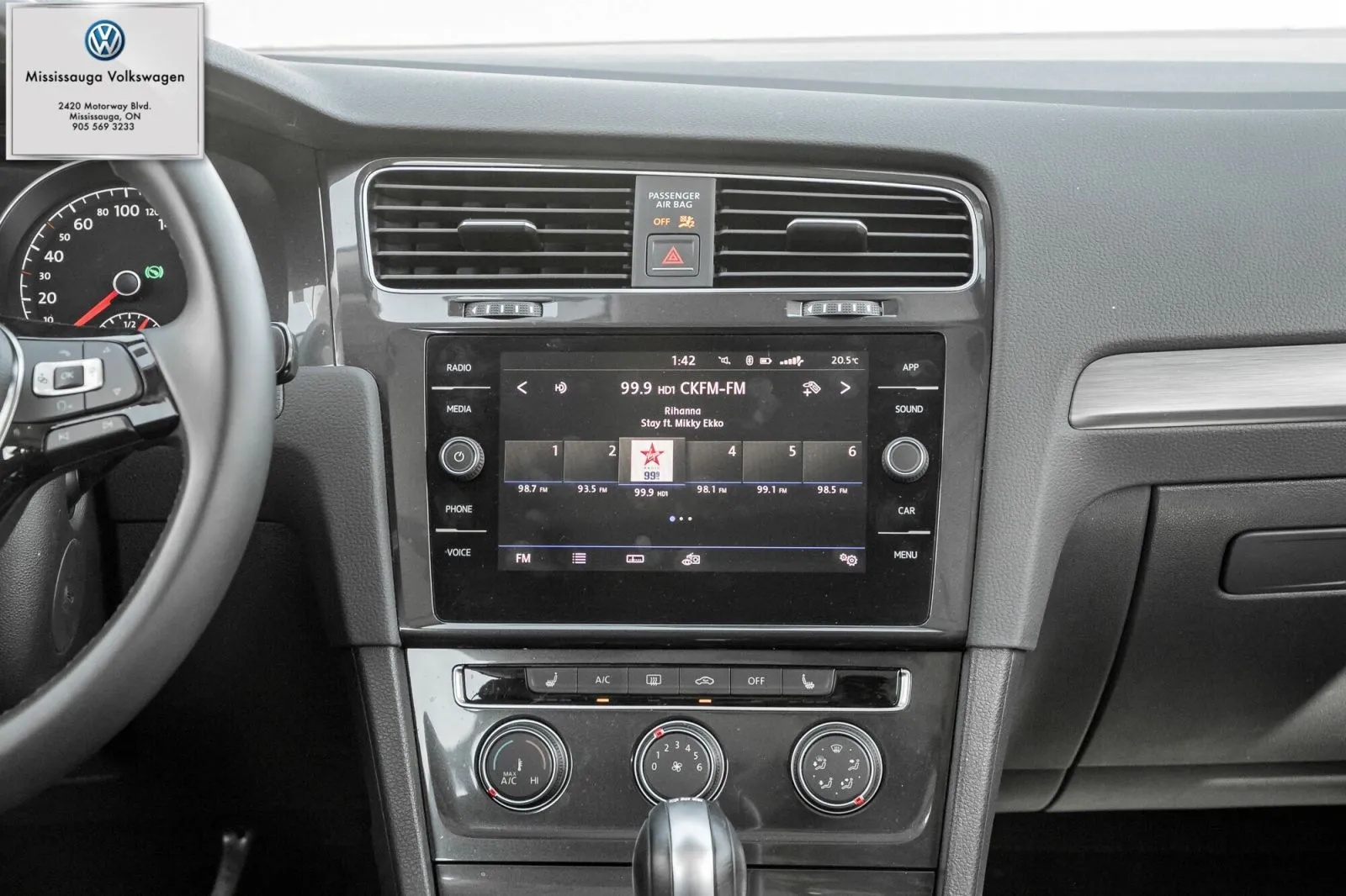
2018: capactive buttons (via Erin Mill’s Auto Centre)
It’s hard to believe VW made this capacitive swap for any reason but cost. Yes, it’s arguable that capacitive buttons were necessary to fit the larger touchscreen… except the 2016 Golf had an EU-only option that was also 8" and had physical buttons (see pg. 8). And, yes, perhaps there was a cool factor, but again, it was likely, "it looks cooler, and it’s cheaper!" I doubt VW would have done this if the change made the car more expensive.
Contrast this with 2020’s (Euro-only?) refresh, which brought a completely-redesigned dashboard & infotainment panel. Zooming out:
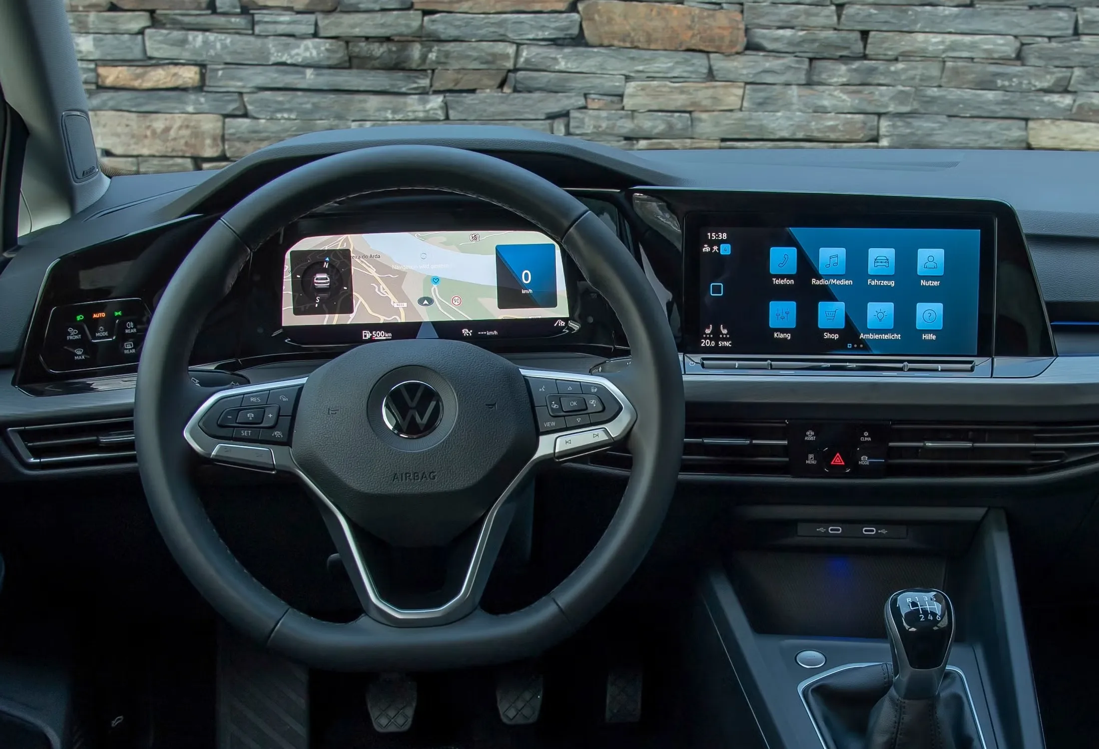
2020: new dashboard, no more volume knobs (via Car & Driver)
2020’s refresh is arguably a “rule of cool” change: it seems like a substantial R&D investment, not something that was instantly cheaper. But again, they include (what strike me as) strong concessions to cost — almost no A/C controls, capacitive temperature sliders, and not even a volume knob.
By the time it reached the US in 2022, they also replaced the physical buttons on the steering wheel with capacitive ones. Even more cost-cutting:
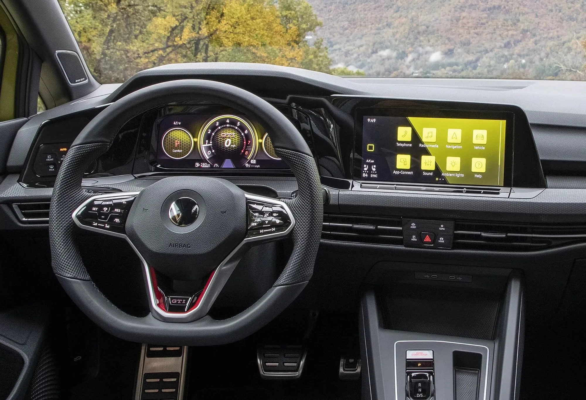
2022: capacitive buttons on the steering wheel (via Car & Driver via VW)
I’m not trying to pick on VW here. Every car company is making these changes. And it’s a bit hard to follow these changes precisely, since trims vary by country. But these changes illustrate the pattern: every design change is made within a culture of cost-cutting.
When VW replaced physical buttons with capacitive ones — on the steering wheel and touchscreen — they were almost certainly cost-cutting. Both changes were basically part-swaps. They didn’t change large swathes of the car, and they probably didn’t take much R&D spending. They even used the same labels & icons! Neither change offers tangible driving benefits: instead, they impede haptic feedback, making the car measurably harder to use, slower, and more error-prone (see this 2019 paper on haptics). The only other benefit I can see is that they might look cool. But, if I may? They don’t.
And in that context, it seems like VW’s 2020 redesign afforded them an excuse to delete several controls (physical A/C controls and volume knobs), shielded by the allure of a new UI.
I wasn’t in the room where it happened; I can’t say what really motivated these swaps. But I can say that these were mistakes that “did a lot of damage” to the brand. Because the CEO of Volkswagen said so! And their design chief, Andreas Mindt:
We will never, ever make this mistake any more. On the steering wheel, we will have physical buttons. No guessing any more. There’s feedback, it’s real, and people love this. Honestly, it’s a car. It’s not a phone: it’s a car.
They promised to add back the buttons:
From the ID 2all onwards, we will have physical buttons for the five most important functions — the volume, the heating on each side of the car, the fans and the hazard light — below the screen. They will be in every car that we make from now on. We understood this.
The 2025 Golf has physical steering wheel controls again:
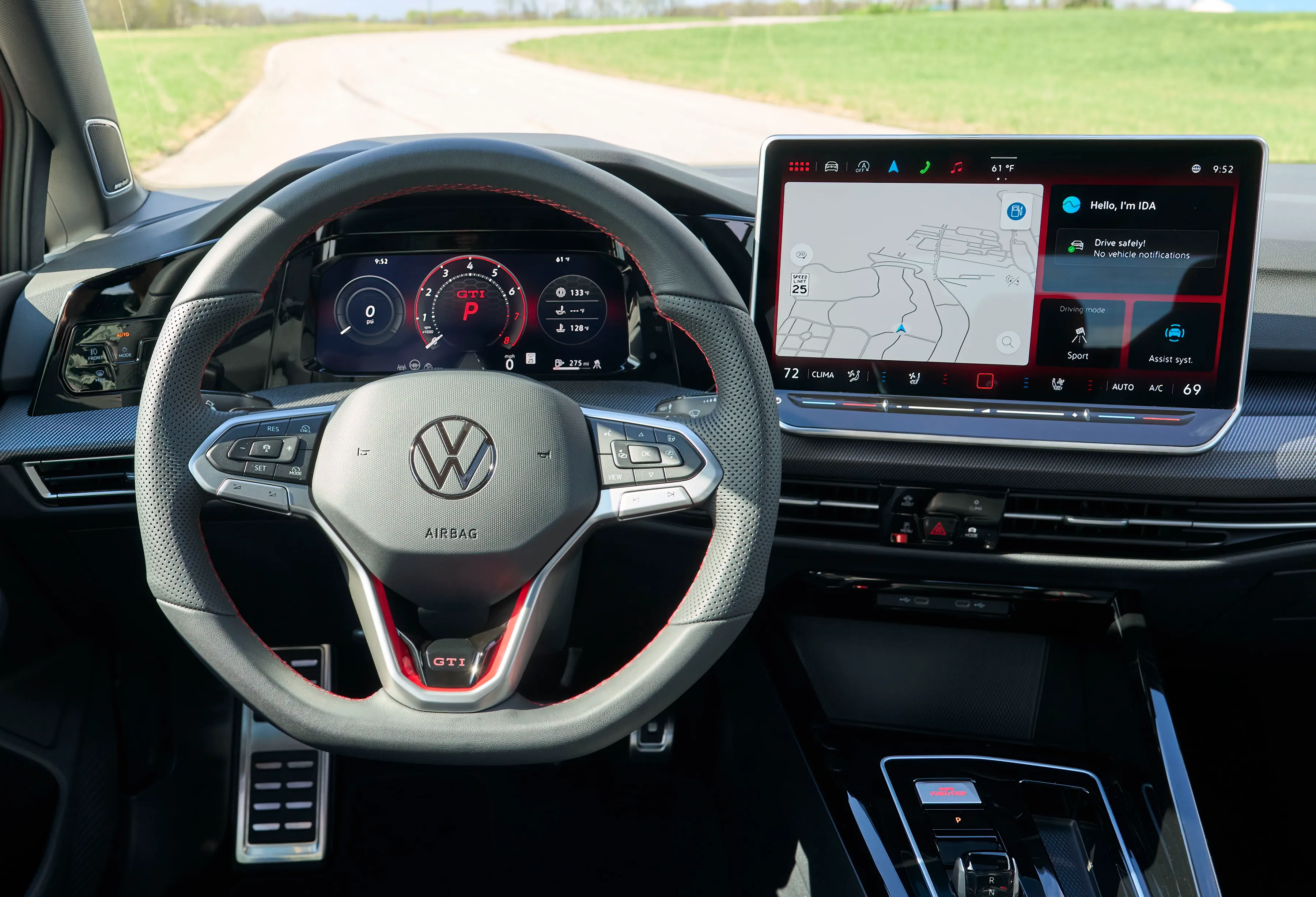
2025: physical steering wheel controls again, but no volume knob (via VW)
But the volume knob’s not back yet. We’ll see.
Honestly, blaming cost is the least cynical attitude you can take. It’s tempting to blame bad designers & bad product management, but that means calling hundreds of people incompetent. Unaware that touchscreens are harder to use.
It’s much kinder to ascribe these decisions to budget cuts. As the inevitable result of a culture of cost-cutting. As rational decisions taken by intelligent people as they produce some of the most complicated products on the planet. Never ascribe to incompetence what can be explained by perverse incentives, I guess.
And this framework works so well. It explains when VW replaces window controls with capacitive buttons in the 2025 ID. Buzz:

@mamasleastfavorite on TikTok:
"Now, if I want to roll down the back window, I can stare down at my knees and fumble around with a touchscreen the size of an almond, all while I'm traveling at 70 miles an hour."
It explains why Honda removed the volume knob in the 2016 Honda Civic, only to add it back in 2019. They tried to reduce cost, and people stopped buying the cars.
And it also makes it so, so much easier to understand the constant marketing blurbs as the excuses that they are, rather than actual reasons (emphasis added):
The new Audi A3’s electronics boss Melanie Limmer told Autocar recently its decision to remove some physical buttons was made as “more and more people are getting into touch functions with smartphones” and added that the new system is as user-friendly as the previous one.
“As user-friendly” is operative here: not better, equal. And it just so happens to be cheaper.
Likewise with all the hoopla about voice control. Rivian’s chief software officer, Wassym Bensaid, at TechCrunch Disrupt 2024 (~14min in; emphasis added):
[…] The other thing is, if we actually had the right technology today, your way of interacting with the car would have been through voice. Because when you’re driving you want to focus on the road, and ideally you would not want to touch the screen.
The fact you’re touching the screen, or the fact that we’re using buttons today, in some cars — I think it’s an anomaly. It’s a bug; it’s not a feature. Ideally you would want to interact with your car through voice. And the problem today is that most voice assistants are just broken — they don’t work. And this is where AI can really unlock & enable very different experiences in the car.
Whether or not I want to scream “volume down 20%” at my car, it’s salient that voice requires no parts. “The best part is no part”? Y’all: the cheapest part is no part.
Actually, electric car companies — like Rivian above and Tesla and Lucid — offer good examples of this culture shift: how touchscreens that once epitomized a culture of cool are now totems of a culture of cost.
Certainly for the original Teslas, touchscreens were magical. Rereading a 2013 review of the Model S rekindles that feeling (emphasis added):
The touchscreen demands attention. It’s the first thing anyone comments on when they enter the cabin, usually with some variation on “Wow, look at that giant screen!”
I remember reading The Oatmeal’s comic about it, although I’d forgotten his vigorous imagery (emphasis added):
Knobs and buttons are almost completely absent from the interior of the car. Instead, it’s got a big juicy iPad-like thing.
From the touchscreen, you can control every aspect of the vehicle. There’s a tiny picture of your Model S that you can touch and squeeze to activate various parts of the car.
I love it. It’s like a little cyborg Tesla fetus that you can poke, prod, and control.
I have no doubt that Tesla bet on touchscreens because they were cool. Giant touchscreens likely cost way more to develop & produce than those shoddy OEM infotainment consoles every other car had in 2013. They were a bet to sell people the future.
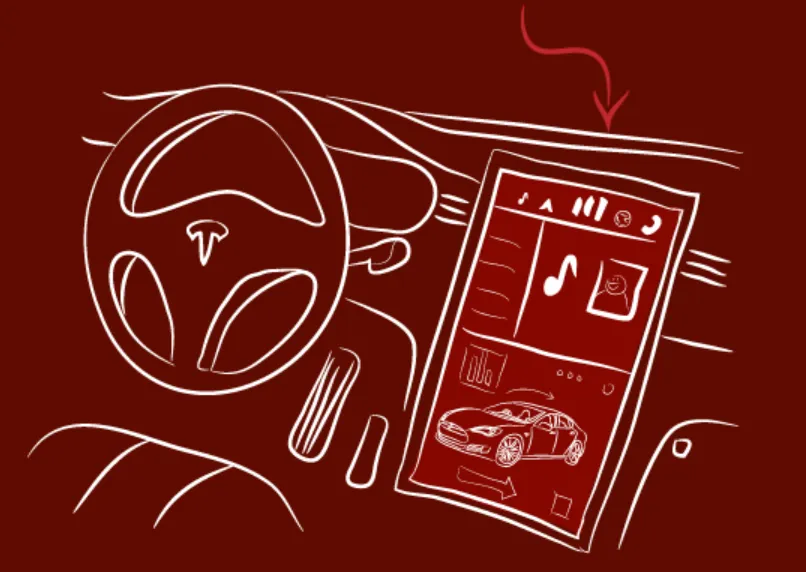
This was awesome in 2013 (The Oatmeal)
Tesla continues to spend on cool (I quite like the 2026 Model Y’s indirect brake light, expensive enough that they’ve since cut it from cheaper trims), but since 2013, more and more of their decisions appear to be bald cost-cutting — simple part reduction.
They even removed (and are now reintroducing) the blinker stalk. Tesla’s von Holzhausen, again, with Jay Leno, speaks of autonomous driving and being able to “infinitely configure” the interior, but Leno’s frustration is palpable. Tesla’s VP of Vehicle Engineering, Lars Moravy, answers simply:
We always say at Tesla, if you aren’t deleting so much that you have to put something back, you haven’t deleted enough.
That philosophy pervades the other odd changes Tesla makes, like replacing physical buttons on their doors and interior lights with capacitive ones.
Take MKBHD’s complaints about Tesla’s vacillating steering wheel designs — when they removed the stalks, they used capacitive buttons (with haptics but no physical flex) in the 2021 Model S Plaid:
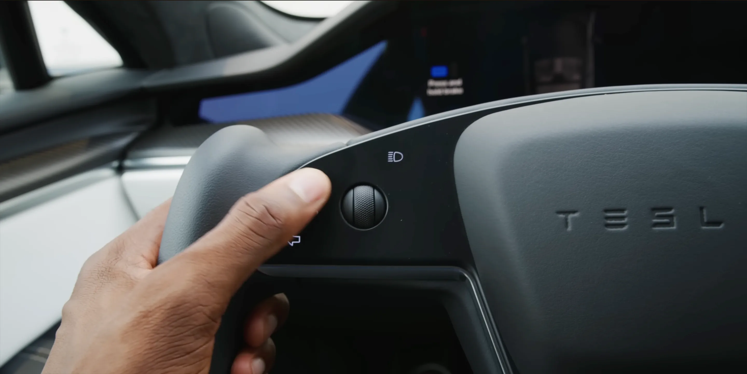
2021 Model S Plaid: capacitive buttons with haptics but no physical flex (via MKBHD)
These became physical buttons in 2024’s Cybertruck (yay):
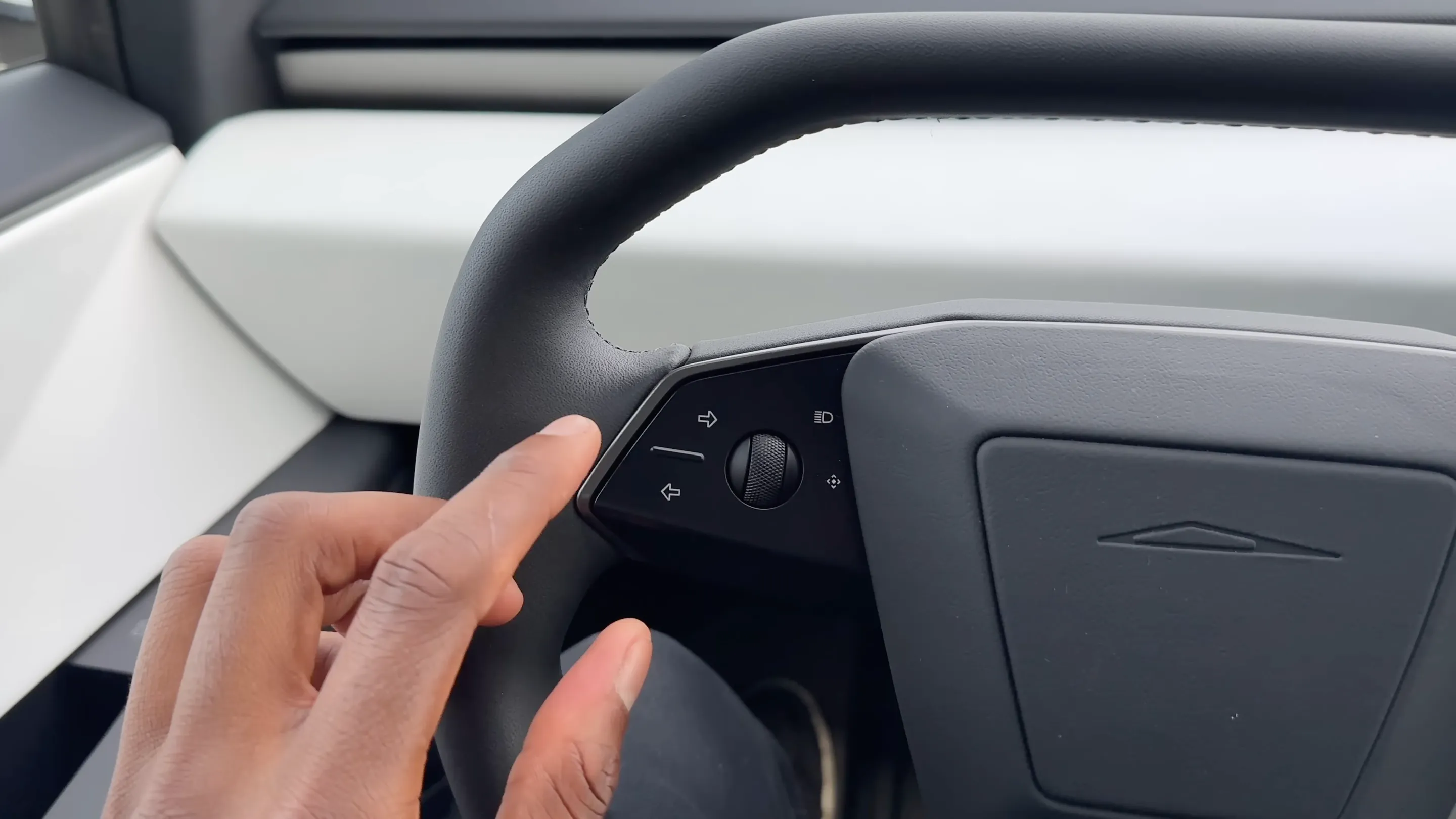
2024 Cybertruck: physical buttons (via MKBHD)
But then went back to capacitive buttons (now with some physical flex) in the Model 3 Performance that year:
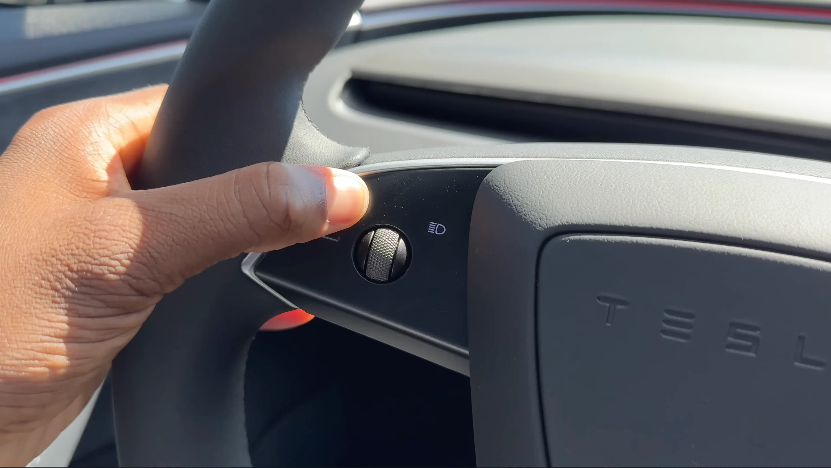
2024 Model 3 Performance: capacitive buttons with physical flex (via MKBHD)
I completely understand if you think these changes were made for coolness or aesthetics or minimalism or some other reason. Tesla of 2021 had earned that slack, unlike many other automakers. But replacing blinker stalks with capacitive buttons, then bringing back the stalk? Removing, replacing, and re-removing steering wheel buttons? Replacing the PRNDL with a touchscreen gesture? Together, these strike me as searching to cut just as many parts as possible, without harming sales.
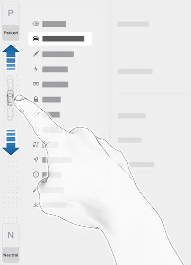
Tesla’s touchscreen shifting (via Tesla)
We discussed many reasons to reduce part count, including aesthetics. But remember it also, also, reduces cost. And to me, that’s a pretty compelling reason.
That brings us to the 2026 Mazda CX-5.
No more rotary dial, no more A/C controls, no more volume knob. It’s all in a giant touchscreen.
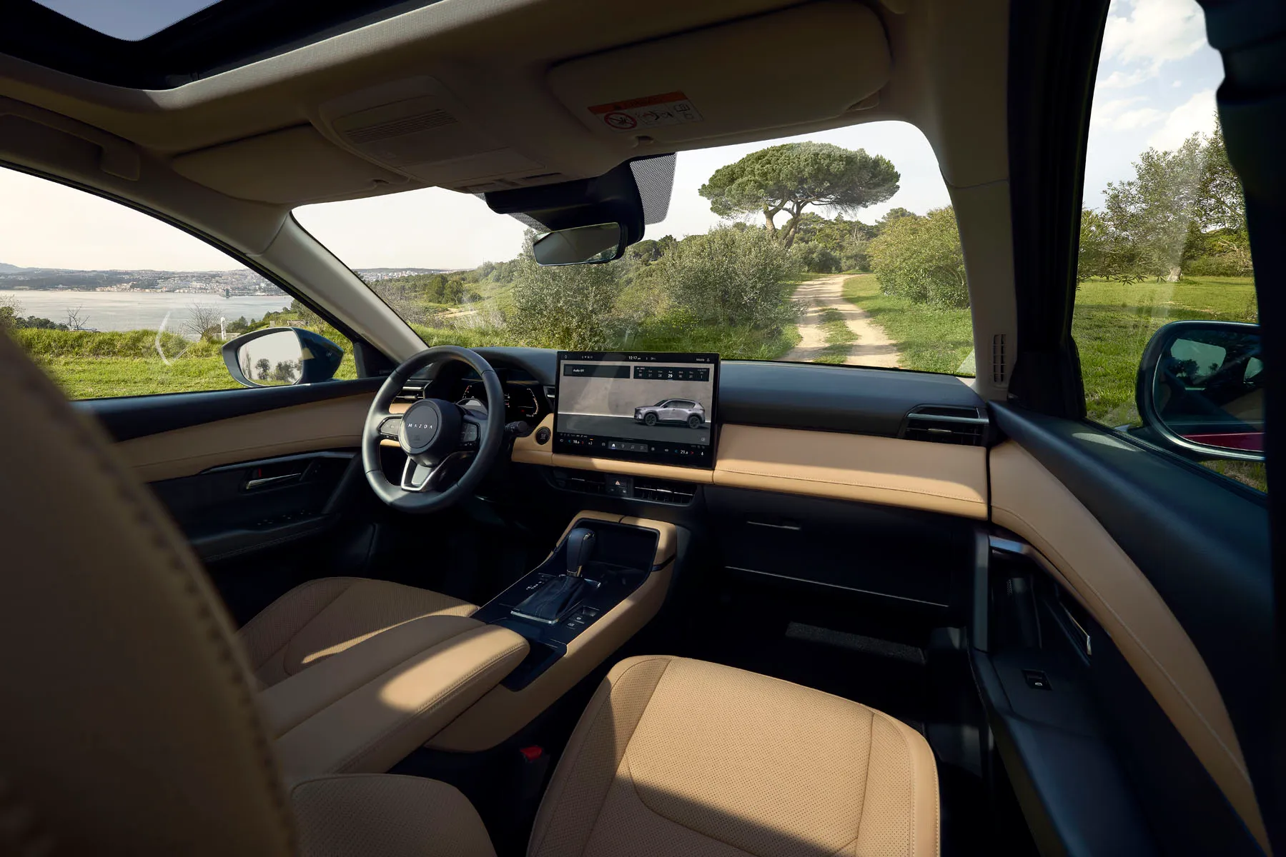
What have they done to my boy?! (via Mazda)
This strikes me as an expensive redesign (actually, the CX-5 is now about $90 more expensive than the CX-50), and Mazda is clear about why they removed the dial (around 7min in, emphasis added):
A big update from Mazda is the inclusion of an all-new 12.9in or 15.6in touchscreen display. Not only is this display unique for a vehicle in this segment, but it’s obviously quite a departure from Mazda, as it no longer controlled by a console-mounted Commander Knob like the previous CX-5.
A lot of consideration was put into this latest iteration of Mazda’s human-machine interface design. And based on internal testing and user research we believe this solution is best equipped to address the wants and needs of our customers.
Touchscreens have become a ubiquitous interface due to their ease-of-use and flexibility in supporting dynamic interfaces. This immediate ease-of-use provides a quicker, more intuitive learning curve for a wider range of users. This is especially true when using popular phone mirroring solutions like Apple CarPlay and Android Auto.
As they summarize it (9m20s, emphasis added):
With the technology suite available in the new CX-5, we have prioritized a new and engaging design that is easy to use for new and returning Mazda customers.
There you have it. The knob is daunting and scary. Too many customers walked into the dealership, balked at the commander knob, and left.
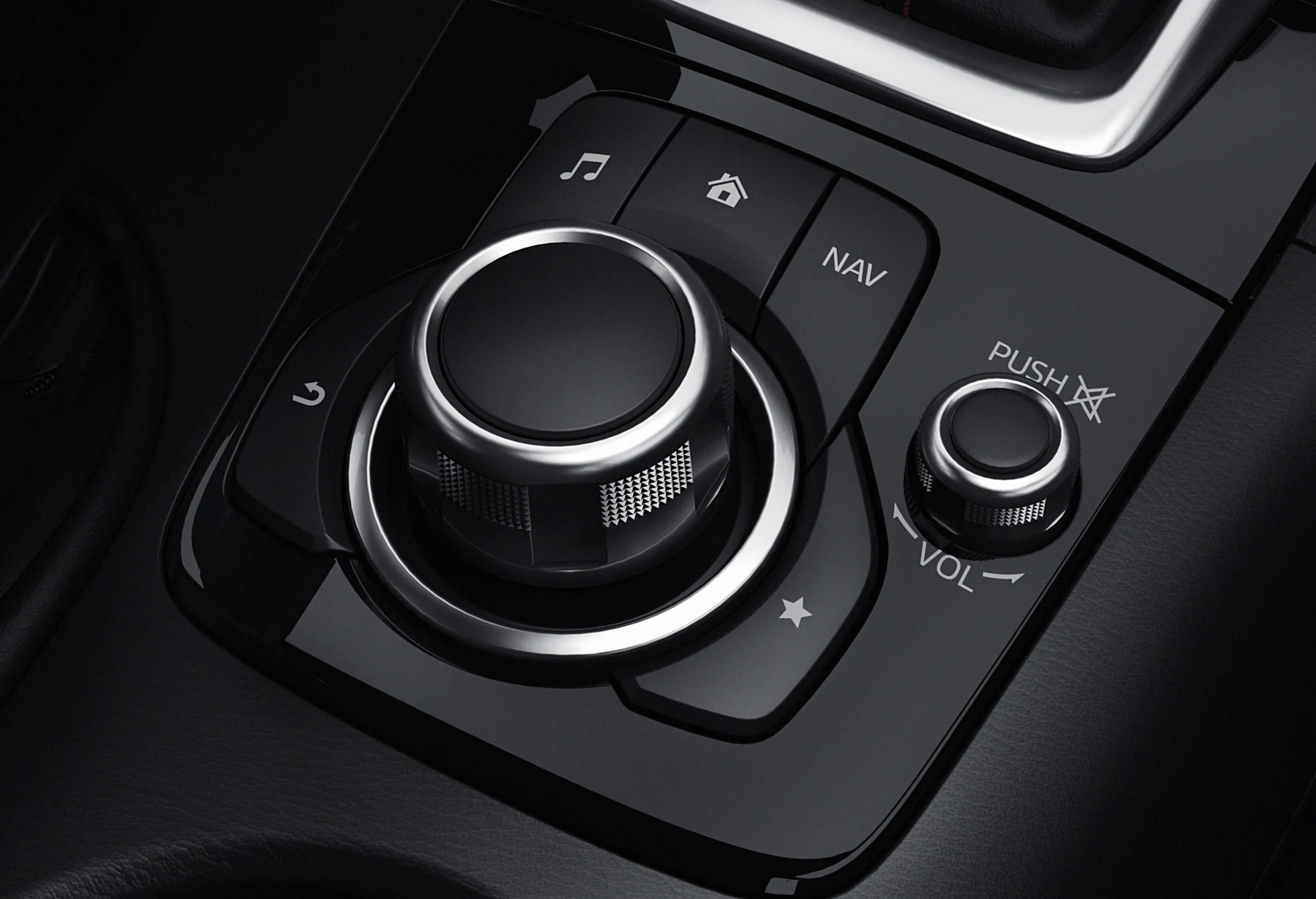
Boo! (via The IT Nerd)
This agrees with lots of other research: several studies demonstrate that command-knob–style interfaces are confusing, difficult, and scary for new users (see Appendix: are touchscreens unsafe?). It’s arguably worse for CarPlay. Those things are true, even if the knob is ultimately safer. Mazda decided to rework their interiors — by removing the commander knob — so fewer customers would buy a RAV-4 instead.
But this redesign has other, more pernicious, changes. No more volume knob. No more physical A/C controls. And the steering wheel now uses one giant button with capacitive sensing (maybe?) to understand which segment you pressed:
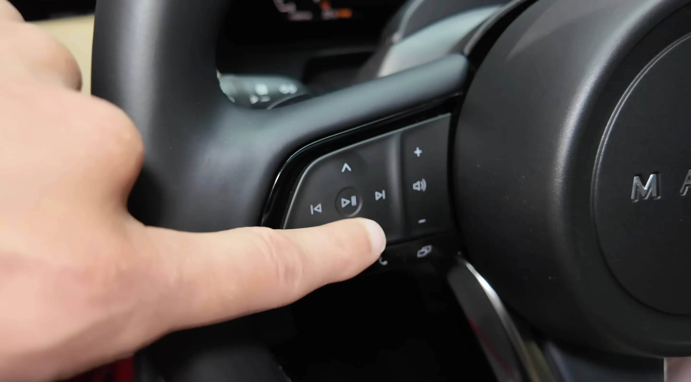
2026 CX-5: one large button (via Autogefühl)
Mazda had no need to remove A/C controls or volume knobs. They had no need to use fake buttons on the steering wheel. Those features confused no one. Those were pure concessions to cost.
So once again, we march to the same point: that removing these features makes the car cheaper. That even the feedback-oriented decisions were made in a process dominated by cost. Mazda is the same company that famously removed touchscreens in 2019 because they found touchscreens unsafe. But why continue to spend on rotary knobs, when no one else is using them and potential customers may find them confusing?
It’s a very difficult budget line to justify, even if the knob is ultimately safer, even if it’s a nifty feature, even if users ultimately prefer 'em once they learn 'em.
Besides (if enough people complain), Mazda execs can always apologize and add (some) buttons back (with ceremony) (in 2027). That’s how they learn they’re deleting enough parts!
I see so many people debating these changes, hedging like me in their responses as they try to guess why Mazda chose to throw away one of their most defining features. We keep starting flame wars that ignore the obvious reasons, and we get hung up on technicalities.
When the Mazda VP of U.S. Operations says, “the Google Assistant will enhance voice control” because “despite this large touch screen, we continue to believe in our safety philosophy, hands on the wheel, eyes on the road,” he doesn’t mean that Mazda believes that voice control will improve safety over the rotary controller. He means that voice control mitigates the harm of switching to touchscreen, at least enough to sate Mazda’s compliance team.
When their public affairs manager writes to Motor1 that, “based on customer feedback,” the new design “prioritizes ease of use while maintaining Mazda’s safe driving philosophy,” she doesn’t mean that the new design is safer — just that it meets some arbitrary safety threshold while also offering that showroom approachability.
Sometimes, we need to take companies at their word. Mazda thinks this new car will sell better. I don’t know if it will — I wouldn’t buy one. I bought my 2024 Mazda3 solely for the buttons. If it’d looked like this CX-5, I’d have bought a Prius (seriously, buttons were the deciding factor). But everyone I know, except for other Mazda owners, finds the knob terrifying. Maybe this buttonectomy will give the CX-5 the curb appeal it needs to become a top-10 SUV.
But sometimes we need to ignore what companies say, or find what they’re not saying.
Because some of these 2026 changes are obviously to save money. No Mazda engineer thinks that touchscreens are better than dials for turning up the heat. No PM argued that volume knobs scared customers. No designer believes that fake steering wheel buttons feel like “zoom-zoom.” So let’s stop assuming that the engineers are stupid, even though this decision ultimately may be.
There are many reasons for car companies to replace buttons with touchscreens. Many reasons are stupid, some are not. Touchscreens may still be cool, they have some safety benefits, and they’re certainly simpler to learn.
But we shouldn’t invent reasons on behalf of automakers. Whenever a button disappears, it behooves us to wonder why it did. I argue the answer is almost always cost. Unsafe at Any Speed proved, in 1965, that automakers will rationally sacrifice any value — including safety — to sell more cars and make more money. Touchscreens teach that lesson again.
Removing a few buttons can save an automaker millions, and maybe even sell more cars. Sometimes, the solution is that simple. And sometimes, what you think is worse — is worse.
Don’t let anyone tell you otherwise.
Thanks to Atherai Maran, Hayden McAfee, Dan Steiner, Drew Humphrey, Tyler Diamond, and Evan Simkowitz for consulting on this article. Thanks to Atherai Maran, Dan Steiner, and Hayden McAfee for editing. ChatGPT and Claude helped with the research for this article. Also thank you to everyone I’ve regaled about this for the last year; thanks for reading it all again.
Want more articles about safe & usable tech?
No spam. Just an email for new posts.
Without pretending to be an expert, I want to share some research I’ve found while writing this article.
First, the US National Highway Traffic Safety Administration (NHTSA) has voluntary guidance for designing safe in-vehicle devices, which focuses on 2 metrics:
- Glance duration: tasks should be completable “with glances away from the roadway of 2 seconds or less”
- Total Eyes-Off-Road Time (TEORT): tasks should be completable with “cumulative time spent glancing away from the roadway of 12 seconds or less.”
There are many other ways to measure driver distraction. Abassi & Li 2021 mentions several, including driving performance (like lane deviation) and physiological & subjective workload (like NASA-TLX surveys), but the NHTSA reports that alternative metrics like this “do not have an established link to crash risk”; only gaze metrics do. Even lane deviation, surprisingly, is a worse metric. Although it correlates well with gaze metrics, a related NHTSA trial found that lane deviation is highly variable, with less than half the statistical power of gaze testing.
By any metric, though, it seems well-established that buttons are generally safer than touchscreens. That’s demonstrated in several studies. Zhao et al 2022:
We found that both air conditioning-related tasks required more visual engagement, longer task completion time, and worse lateral vehicle control under FTIM [Full-Touch Interaction Mode].
Likewise, Nagy et al 2023 (which studied the Volkswagen Golf we discussed!) wrote that touchscreens cause “higher visual, manual, and cognitive distraction” than physical buttons. Yin et al 2024 found that touchscreens alone were less safe and usable than touchscreens+buttons and buttons alone. And a 2013 NHTSA study found that radio tuning knobs were nearly 2× faster than both touchscreens and physical buttons across 12 vehicles.
However, it’s clearly possible to design touchscreens that outperform buttons (consider the article we open with, Bach 2008). My beloved Mazda commander knob and BMW’s iDrive are especially affected: although evidence conflicts, multiple studies show that touchscreens outperform central rotary knobs. For example, Harvey et al 2011 found that rotary knobs were worse than touchscreens by almost every metric, and even largely pro-knob articles like Large et al 2019, Large et al 2016, and Rümelin & Butz 2013 find that touchscreen are significantly faster to use than rotary knobs.
I could quibble with these pro-touchscreen results. As I mention in the main article, buttons and knobs tend to have longer overall TEORT but fewer long-duration glances — so by the NHTSA’s preferred metrics, the outperformance of those well-designed touchscreens may not yield more safety. Even the authors seem surprised by their results: Harvey points out several potential confounders, like poor UI design & steep learning curves.
But touchscreen’s ability to outperform (at least some) physical controls should convince even the most die-hard button enjoyer that it is likely that touchscreens are safer in some cases, even if they are often or usually worse.
It is also worth discussing the scale of distraction-related accidents. Per the NHTSA, of all 6mil US police-reported crashes in 2010, about 26,000 occurred while using vehicle controls. That is less than 1% of all crashes, but it still amounts to one every 20min, and it is comparable to that year’s cellphone-related crashes (47,000 in 2010) which warranted decades of distracted-driving laws.
So back to the core of it all:
I think today’s touchscreens are less safe than yesterday’s buttons. Or, more strongly, touchscreens are certainly not safer than buttons in general. There is plenty of evidence to suggest that’s true. But there is also enough evidence for you to disagree in good faith.
I think that’s immaterial, though. Because the lurking variable is still cost. If buttons are more expensive, automakers will happily get rid of them if they think enough people don’t know (or don’t care) that they’re safer. That, at least, should be hard to disagree with.
 Instagram Engineering
 Shopify Engineering